
SuperCarros.com & SuperCasas.com
Rebranded in 2011, rebuilt in 2015


Role
Communications and Technology Manager, Cibermercado
Led
Logos redesign and websites redesign and rebuilding
Team
Founder, Product Managers, Development Agencies.
Tasks
Two visual identities, two websites, a rebuilt back-end.
The ask
In 2011 the company wanted SuperCarros and SuperCasas to look and feel like the larger international businesses of the time, and to show a company that led in innovation, service, and positioning.


The identities
We dropped the literal illustrations. Both new marks share the same orb containing a capital S at the start of each name. The colors and the words “Carros” and “Casas” tell the two brands apart. I also made a grayscale version of both logos for when they appear together, so the two color palettes don’t clash.



The websites
We moved from the dark theme launched in 2009 to light, white pages, SuperCarros first (2015) and SuperCasas a year later (2016). The light background came directly from testing: end users preferred it over dark. In the redesign the site became all about the search tools, with different ways of finding what users are looking for.
What happened
- Both sites are still live on the 2015–16 design, largely unchanged after more than 10 years. For a site that’s updated all the time, that is the best proof the design worked. The extra ad spaces and the green “Financia” sections were added after my tenure.
- The 2011 identities are still in use today.
- Monthly organic visits grew from ~450K to 1.1M+ over my tenure, a result of the whole team’s work on content, ads, and the sites. I owned advertising, communications, and PR across that period.
How I ran it
- Constraints. Development was always outsourced. The 2015 switch from one provider to another meant keeping a platform built by the outgoing team running while the new provider rebuilt the entire back-end from the ground up. I managed that overlap.
- Testing on a small budget. I had budget for one formal end-user session (front-end) and one formal customer session (back-end). I added informal rounds with trusted clients and friends. The testing decided the biggest visual call: end users preferred a light background over dark, so the new pages are white.
- The hard call: banners. The site was already busy, and the listings are the core business. Banners had to earn advertisers’ attention without turning the page into a loud fight that buried the listings. There were no written rules. This meant constant negotiation with the sales team, clients, and leadership, one placement at a time, with the listings as the thing I protected.
- The team. I defined the in-house designer role and interviewed and hired three designers over the years, and ran advertising, print media planning, and PR alongside the design work.
What I’d do differently
Testing paid off where we had it. It decided the light background, and I’d have liked much more of it. With budget for only two formal sessions, most other decisions rested on informal feedback from trusted clients and friends. More testing would have helped this project, and next time I’d make the case for it at the start, using what the first sessions had already changed.
Screenshots
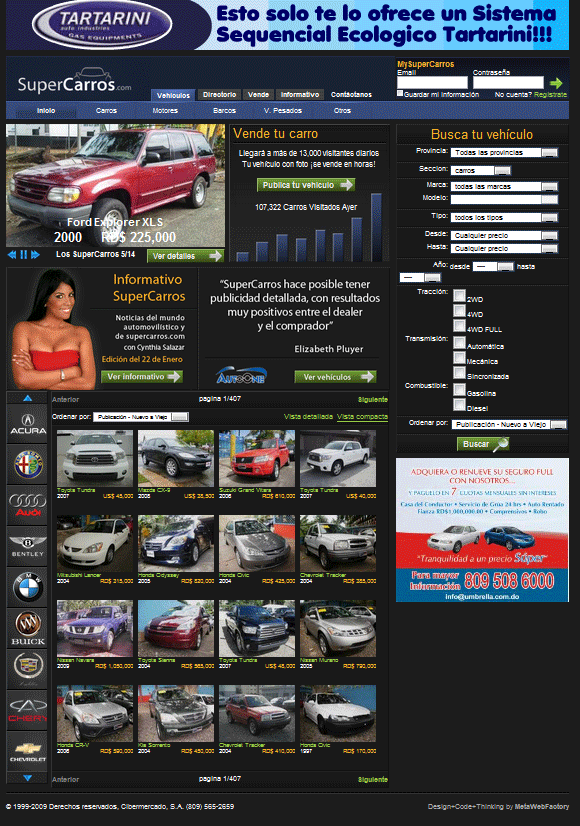 Homepage Design 2009-2015
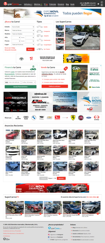 Homepage Design 2015-Present
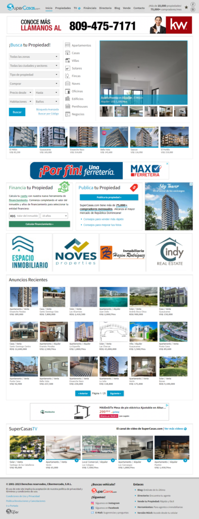 Homepage Design 2016-Present
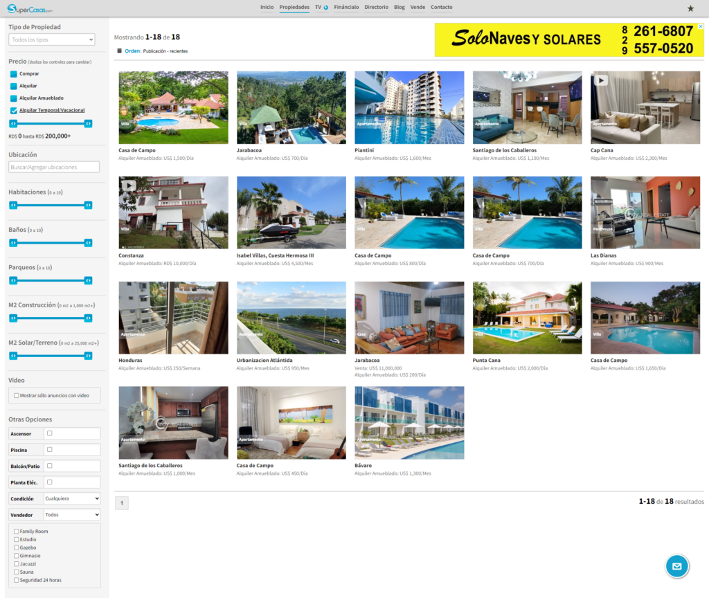 Search Page Design 2016-Present