
Roots & Fruit
An identity built on the metaphor itself.
Designed the Roots & Fruit logo and brand architecture for the client’s team to implement.
The ask
Roots & Fruit works as a fractional CGO for SaaS and WordPress product companies. They align product, marketing, and customer strategy so founders build companies that scale with intention instead of chasing short-term wins. The founder came to me with a solid strategy and a clear metaphor for how they work: strong roots produce lasting fruit. They asked for an identity that felt human and still worked for a tech audience.
The real problem
The identity had to carry both halves at once, grounded and ambitious, without tipping too far into either.
Role
Brand designer: research, exploration, and final execution.
Client
Roots & Fruit, a fractional growth agency for SaaS companies
Handoff
Logo suite, color palettes with an accessibility matrix, favicon set, and illustration library
Timeline
About 6 weeks from brief to launch.
The exploration
The client arrived with a few ideas. One of them played on the negative shape of a tree. I pushed further into the roots-and-fruit concept itself, treating the metaphor as the design, not as a tagline. I took three directions to the client:
The rune for harvest. I turned the rune on its side so one arrow points down, to the deepening of the roots, and the other points toward growth. It’s a rounded-square icon with a serif wordmark.

The “rf” leaf monogram. The letters “r” and “f” composed into a leaf-like abstract shape, with a rounded sans-serif wordmark to keep it from feeling too corporate.

The root-over-fruit mark. We followed through with the organic shape since the brief asked for something human that still worked for a tech audience.

The decision
The roots stand for the strategy work: unglamorous, foundational, done before any growth is visible. The fruit stands for what that work produces: revenue and retention that hold up.
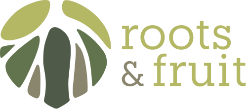
- The mark. A root sits over a fruit, using negative space. At the same time, the separate pieces show what a business, a plan, or a project is made of, which is why they’re colored in different shades.
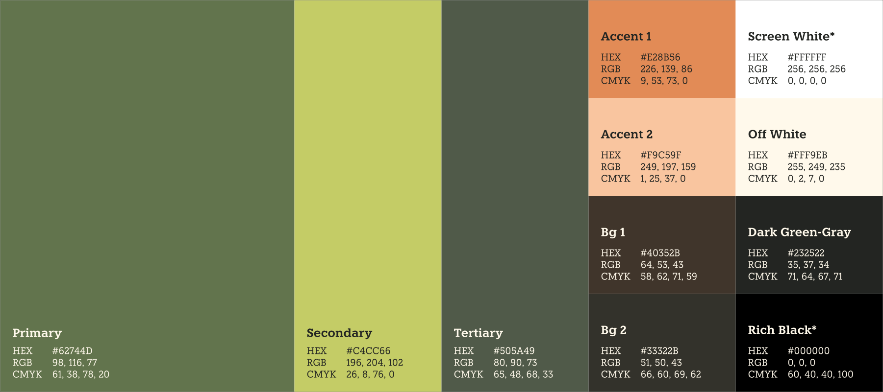
- Color. The palette is green-forward and simple, because it comes from the idea of growth. The logo uses four greens and a cream. The wider brand palette adds warm tones and dark neutrals, adjusted for accessibility. The warm tones keep the conceptual reference to the organic, and nod to botanists’ notebooks, which the illustrations reinforce.
- Type. Knile (Atipo Foundry) for titles, because it sits between a classic serif and a more modern look. I proposed Instrument Sans for body text because its shapes work well with Knile. Working with the client, we settled on Nunito Sans instead: it has a wider range of language-specific variants, so automatic translations stay readable, which mattered to them.
The system
I handed the team more than a logo. The file includes:
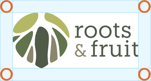
- Usage rules tied to the logo itself. The safety margin is the size of the “o” in “roots.” The base of the “r” sets the space between the icon and the wordmark. The icon’s margin is measured in its own pieces. The team can apply the rules by eye, without a ruler.
- A palette tested for accessibility, with a combination matrix that shows which color pairs work for text, and a note to use white and rich black only for very high contrast on small text.
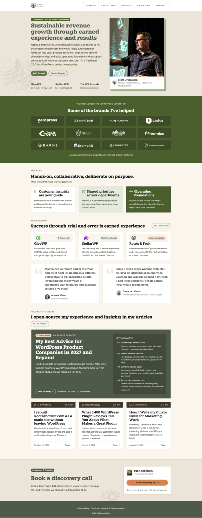
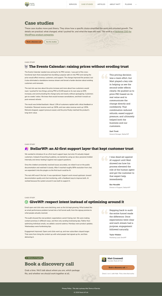
- Color and type applied to a real marketing page and a product dashboard, so the founder could see the system working before building anything.
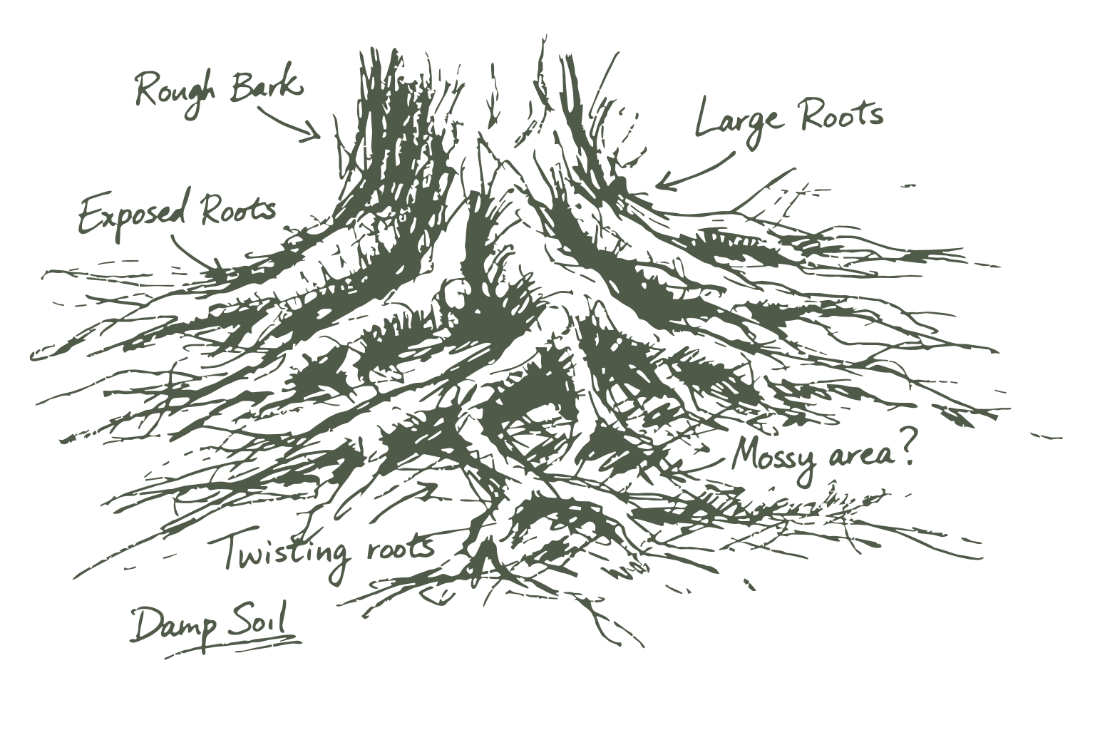
- An illustration library (roots, xylem, peaches, a cornucopia, a windswept branch), delivered as editable SVGs, transparent PNGs, and color tests. I wrote the prompts for the illustrations, then converted them to vectors in Photoshop and Illustrator.
What happened
The logo is live on the client’s site. They built the site themselves from the brand system, and I did a design QA review to make sure it followed the guidelines. That is the test of a system: someone else built with it and it held.
What I’d do differently
I proposed Instrument Sans for the body text because its shapes work well with Knile. We ended up with Nunito Sans, because the client needed automatic translations to stay readable and it covers more language-specific variants. Next time I’d ask about languages and localization in the first conversation, before I propose any typeface.