StellarWP
One logo, a kit, and the sub-brands.
Redesigned the StellarWP logo and built the shape-and-color kit that other brands grew from.




Role
Multimedia Designer, in-house, Mar 2024–Nov 2025
Task
Logo redesign and the shape-and-color kit
Team
Designers, Creative Director, Chief Innovation Officer
Timeline
About 8 weeks from brief to launch.
The ask
StellarWP wanted a logo with an icon. The old logo was typographic only, and everyone agreed it lacked a recognizable mark that could stand with or without the wordmark. The wordmark also had a problem I could see right away: the S in “Stellar” felt unbalanced.

The exploration
We explored directions from more literal to less literal, presented as variations on a theme rather than as finished options. Because this was an in-house team, we worked in the files together instead of through set presentations. A member of leadership and a member of senior leadership owned the project and made the final call on direction.



The decision
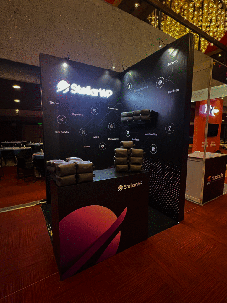
We landed on a planet. It’s familiar enough to point to “Stellar” as space, and the ring casts a cut-out shadow that gives the mark something to look at and makes it easy to recognize.
The wordmark kept the same base font, so it still ties back to the company’s own history, but I customized it to make it more unique. I rebalanced the S, and I replaced the font’s two-story a with a geometric, round a. The new a made the wordmark cleaner and more modern.
A setup for growth
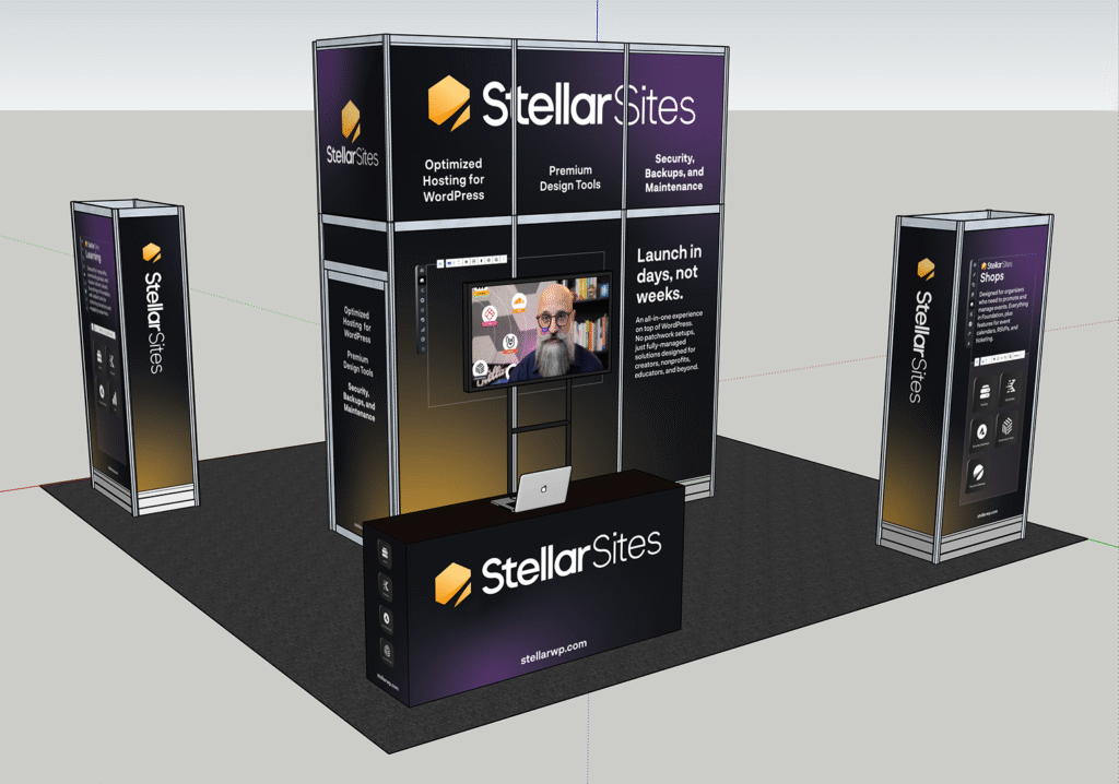
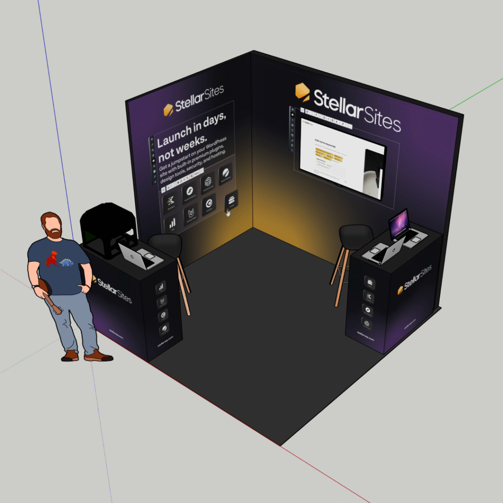
I took the idea of the ring’s shadow and expanded it into a set of shapes and colors that can be mixed and matched. That kit became the starting point for sub-brands. StellarPay and StellarSites took shape from it, and once each project’s leadership gave clear direction, both brands came together in a matter of days.






What happened
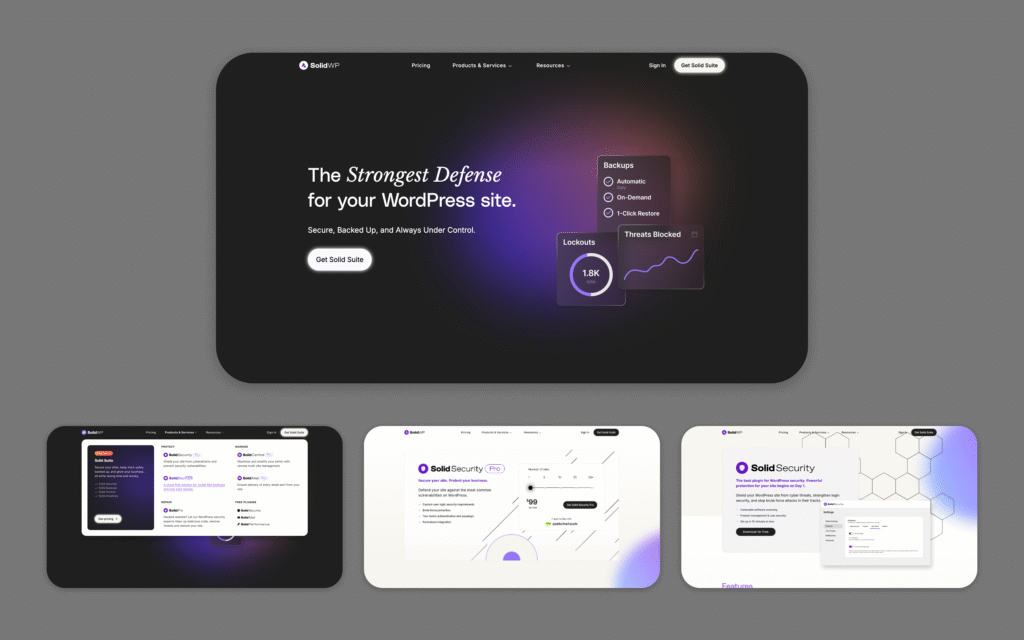
- The kit reached three brands: StellarPay and StellarSites were built from it, and the SolidWP icon was redrawn from it.
- Both new sub-brands were built in days from the kit, once each project’s leadership gave direction.
- A colleague describes the result in his own words. “He’s the creative mind behind the StellarWP logo, colors, and so much of the visual clarity people associate with the brand.” Read more.
- Most StellarWP brands have since been folded into the Liquid Web and Nexcess brands. The kit did its job while they existed, and I’d say so plainly.
Applications
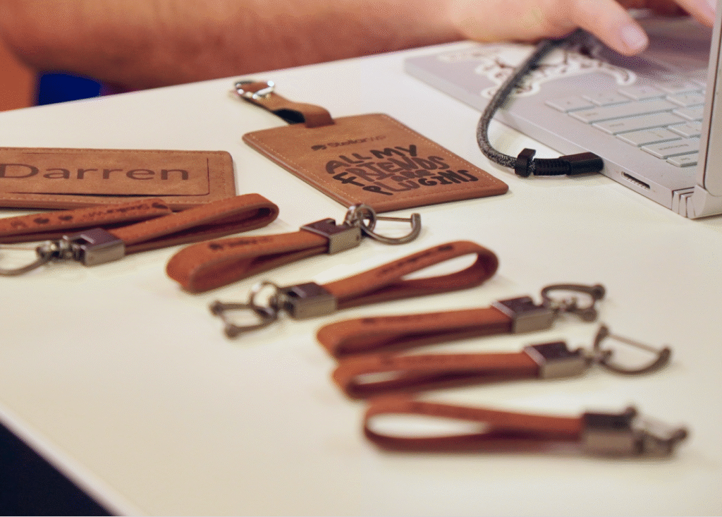
The identity showed up on booths, websites, ads, swag, and printed promotional material for fairs.